Nexae's Logo Update
From the Latin word “to bind”
Nexae is a highly efficient logistics platform that aims to simplify the process of generating and printing shipping labels for both B2B and B2C businesses worldwide. As part of their unwavering commitment to excellence, Nexae recently underwent a complete visual identity overhaul to better reflect the essence of their services. The project involved a logo rebranding, which was carefully crafted to maintain their core values while presenting a fresh, modern image to their clients. With this new identity, Nexae looks forward to continuing its role as a pioneering logistics solution, dedicated to facilitating seamless transportation and providing outstanding customer experience to its users.
Throughout the logo rebranding process, it was crucial to strike a balance between refreshing the visual identity and maintaining brand recognition. Nexae’s existing logo elements were carefully preserved to ensure that loyal customers and partners could easily identify the rebranded logo. By staying true to their core identity, Nexae demonstrates their dedication to consistency and reliability.
for final approval
per month
From the Latin word “to bind”
Nexae is a highly efficient logistics platform that aims to simplify the process of generating and printing shipping labels for both B2B and B2C businesses worldwide. As part of their unwavering commitment to excellence, Nexae recently underwent a complete visual identity overhaul to better reflect the essence of their services. The project involved a logo rebranding, which was carefully crafted to maintain their core values while presenting a fresh, modern image to their clients. With this new identity, Nexae looks forward to continuing its role as a pioneering logistics solution, dedicated to facilitating seamless transportation and providing outstanding customer experience to its users.
Throughout the logo rebranding process, it was crucial to strike a balance between refreshing the visual identity and maintaining brand recognition. Nexae’s existing logo elements were carefully preserved to ensure that loyal customers and partners could easily identify the rebranded logo. By staying true to their core identity, Nexae demonstrates their dedication to consistency and reliability.
The rebrand
The logo rebranding was initiated to enhance Nexae’s visual identity and effectively reflect the company’s fundamental principles of simplicity and efficiency. The redesigned logo unmistakably testifies to Nexae’s unwavering commitment towards providing customers with a smooth and uncluttered experience. The new minimalist and refined design accentuates the simplicity with which both businesses and customers can interact with Nexae’s logistical system. As a result of this change, Nexae aims to cultivate a strong and consistent brand image that underlines its core values and strengths while also establishing trust and value in the minds of its target audience.
Original
Explore more
Mostly Harmless's Promo Video
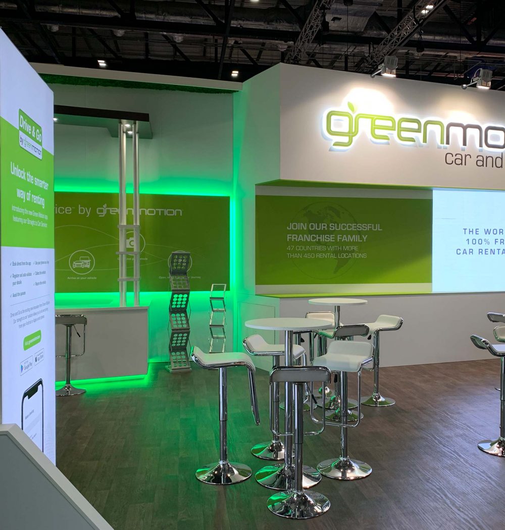
Green Motion's Trade Show Stand
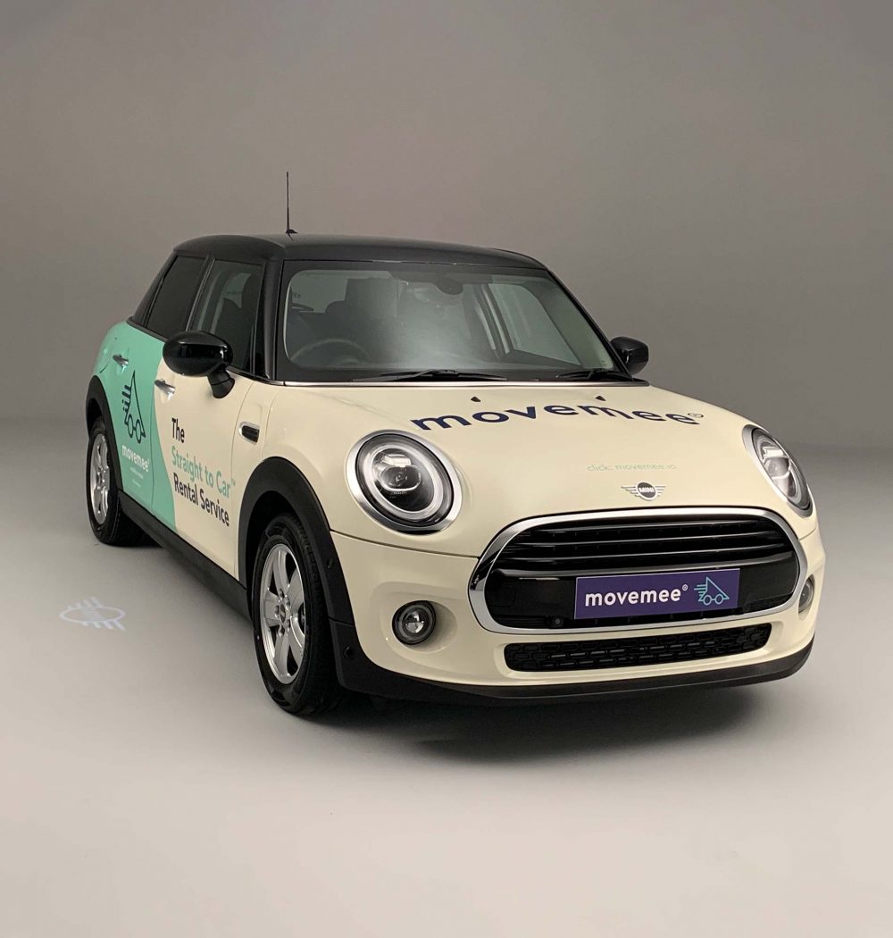
Move Mee's Vehicle Livery
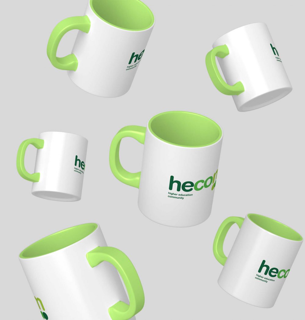
Hecom's Promotional Items
What Our Clients Say
KC Tuition
When I required artwork for a new branding, I knew I needed a creative design agency on the same wavelength as myself. We-Design was the best choice. They took the time to discuss the brief and delve deeper into my final expectations. They quickly followed up our initial meeting with an array of outstanding examples by providing multiple artworks, they had allowed me to make a faster decision and proceed promptly in producing the signage. I was thankful That I found We-Design.
The Red Lion Pub
We have been working with We-Design since the re-brand of our logo in 2016. They have provided a sterling service and extremely high-end print for us. We plan to work alongside We-Design for the lifetime of our brand and would highly recommend them for print & design.
Daily Zen
It was a pleasure working with We-Design. They were fast, flexible and very creative. Their proposals always improved the project. I would work with them again without a doubt.
Sonora Estudios
We-Design designed and created a website and business stationery for K.C. Tuition Services. I was delighted by the end-product and impressed by their skills, creativity and attention to details. After careful research We-Design also made useful suggestions which enhanced and complemented my needs and preferences. I would not hesitate to recommend We-Design to anyone who wants to create a new and original website and related products or who wants to simply up-date their existing one.