MHI's A4 Bi-fold Direct Mailer

Direct Mail

Mail Handling International is an esteemed organization with expertise in national and international delivery services. Our recent print campaign has successfully targeted book sellers and suppliers, with the help of an aesthetically pleasing and eye-catching direct mailer. The campaign design comprised of a bookmark, and an exclusive colour scheme. With an aim to transform book delivery services across the globe, the campaign prioritised both functionality and visual appeal.

To maximise engagement and create a lasting impression, we designed a direct mailer as the centrepiece of the campaign. This mailer served as a visually captivating introduction to Mail Handling International’s services. With a striking photo of a bridge on the cover, symbolizing the connection between books and global distribution, the mailer immediately captured recipients’ attention and sparked their curiosity.

Features

MHI Book Campaign 2

Direct Mail

Mail Handling International is an esteemed organization with expertise in national and international delivery services. Our recent print campaign has successfully targeted book sellers and suppliers, with the help of an aesthetically pleasing and eye-catching direct mailer. The campaign design comprised of a bookmark, and an exclusive colour scheme. With an aim to transform book delivery services across the globe, the campaign prioritised both functionality and visual appeal.

To maximise engagement and create a lasting impression, we designed a direct mailer as the centrepiece of the campaign. This mailer served as a visually captivating introduction to Mail Handling International’s services. With a striking photo of a bridge on the cover, symbolizing the connection between books and global distribution, the mailer immediately captured recipients’ attention and sparked their curiosity.

Features

International Book Delivery 101

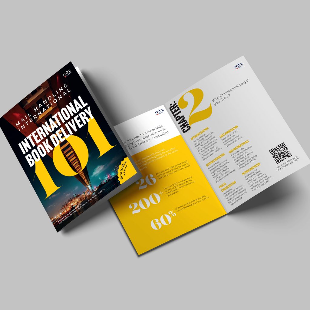
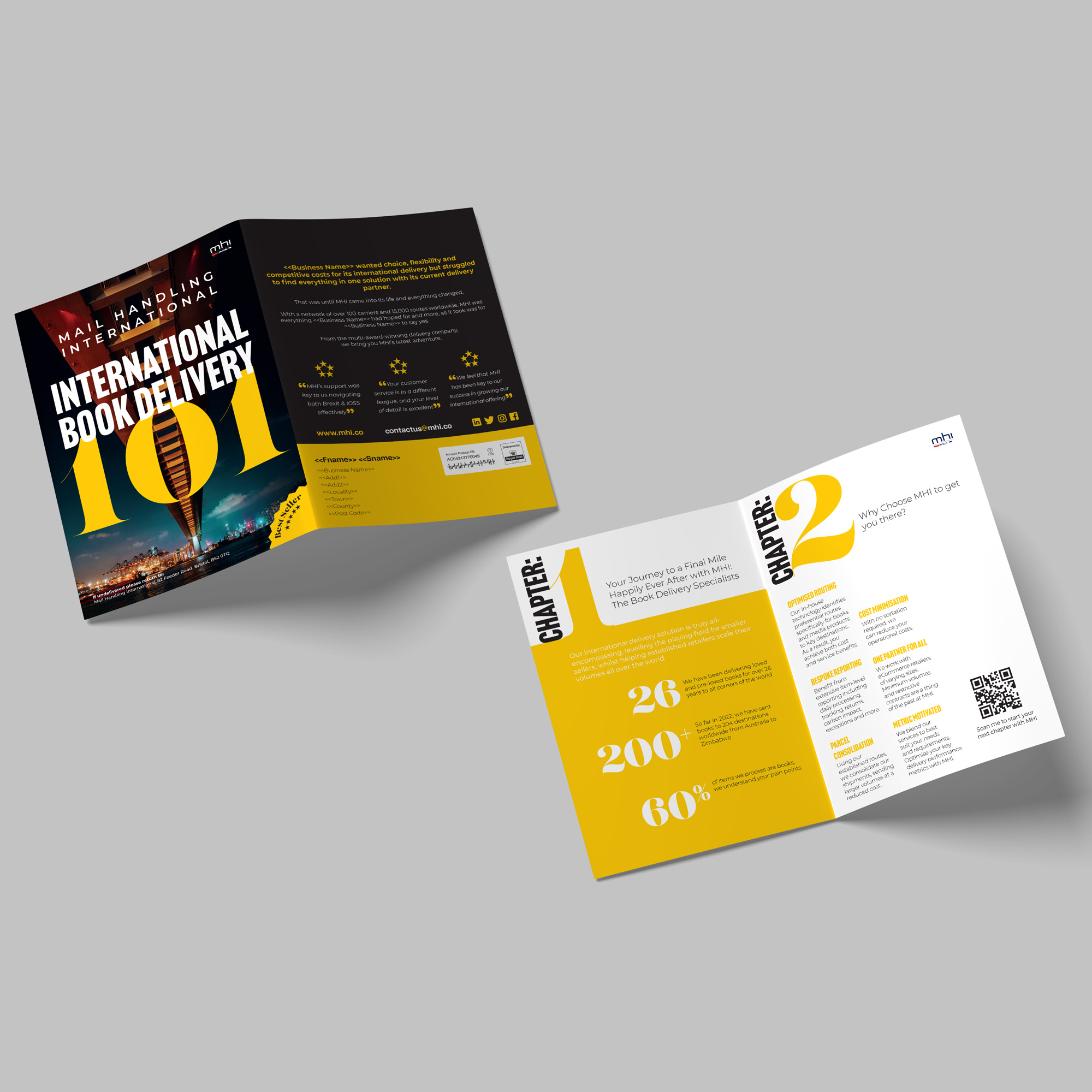
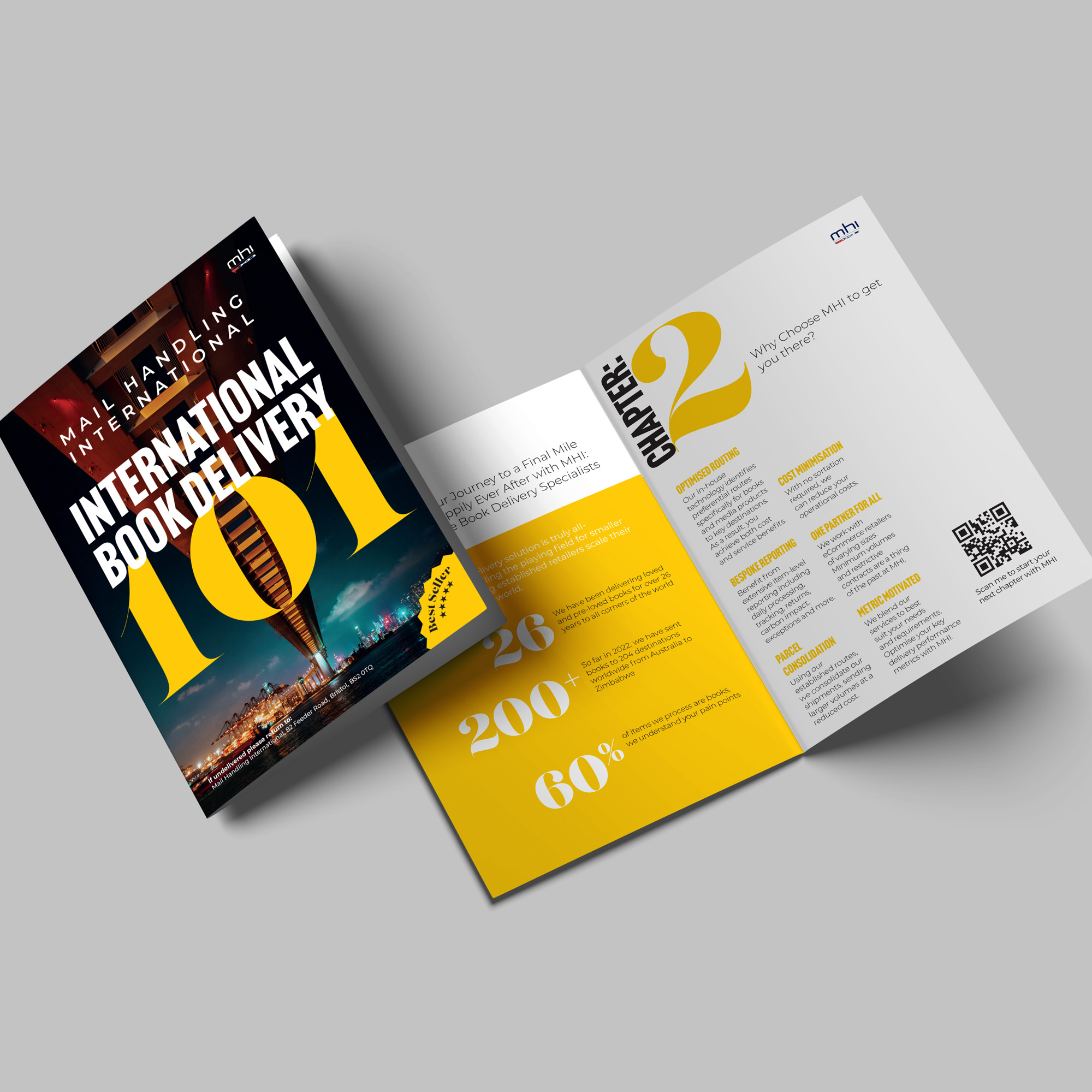
Our team incorporated a contemporary and crisp appearance in the development of the print campaign, utilizing a clean sans-serif font that exuded professionalism and clear communication. The utilization of colors also played an integral role in creating a visual impact, with yellow and black being the primary hues. Yellow was selected to represent the vibrancy and passion of the literary community, while black conveyed an impression of stability and dependability.

Explore more

Play Video

Mostly Harmless's Promo Video

green-motion-trade-show

Green Motion's Trade Show Stand

Move-mee-vehicle-signage

Move Mee's Vehicle Livery

hecom-promotional-items

Hecom's Promotional Items

What Our Clients Say

We-Design designed and created a website and business stationery for K.C. Tuition Services. I was delighted by the end-product and impressed by their skills, creativity and attention to details. After careful research We-Design also made useful suggestions which enhanced and complemented my needs and preferences. I would not hesitate to recommend We-Design to anyone who wants to create a new and original website and related products or who wants to simply up-date their existing one.

    Kim Charleston

    KC Tuition

    When I required artwork for a new branding, I knew I needed a creative design agency on the same wavelength as myself. We-Design was the best choice. They took the time to discuss the brief and delve deeper into my final expectations. They quickly followed up our initial meeting with an array of outstanding examples by providing multiple artworks, they had allowed me to make a faster decision and proceed promptly in producing the signage. I was thankful That I found We-Design.

      Peter Smith

      The Red Lion Pub

      We have been working with We-Design since the re-brand of our logo in 2016. They have provided a sterling service and extremely high-end print for us. We plan to work alongside We-Design for the lifetime of our brand and would highly recommend them for print & design.

        James Hodge

        Daily Zen

        It was a pleasure working with We-Design. They were fast, flexible and very creative. Their proposals always improved the project. I would work with them again without a doubt.

          Imanol Ortiz López

          Sonora Estudios

          Some of our clienets

          JGS logo
          movemee logo white
          mhi
          NEXAE