SendVia's Rebrand
Logo Rebrand
SendVia specializes in direct mail services and approached us for help in rebranding their identity. They aimed to update their image while maintaining their industry-trusted reliability. They sought a strategy that would ensure their status as a leader in the industry. As such, we researched their target audience and analyzed market trends to develop a creative rebranding plan.
In today’s fast-paced digital landscape, simplicity is often the key to capturing attention and conveying messages effectively. With this in mind, we employed a minimalist approach to SendVia’s design. An ample white space and a carefully chosen colour palette contributed to a sleek and uncluttered aesthetic. By reducing visual noise, the brand’s message became more accessible and memorable to their target audience.
- Website Analysis
- Increase Traffic 100%
- Content Optimization
- Weight Management
- Costume Design
- 3 Months Guarantee
- Design Improvements
- 24/7 Online Support
The rebrand
To give SendVia a contemporary look, we utilised gradients as a key design element throughout their branding materials. By blending vibrant blues & purples together, we created a visually captivating effect that symbolises the seamless and dynamic nature of their services. The gradient was applied to the company’s logo, website, and marketing collateral, providing a sense of depth and fluidity.
Original
Explore more
Mostly Harmless's Promo Video
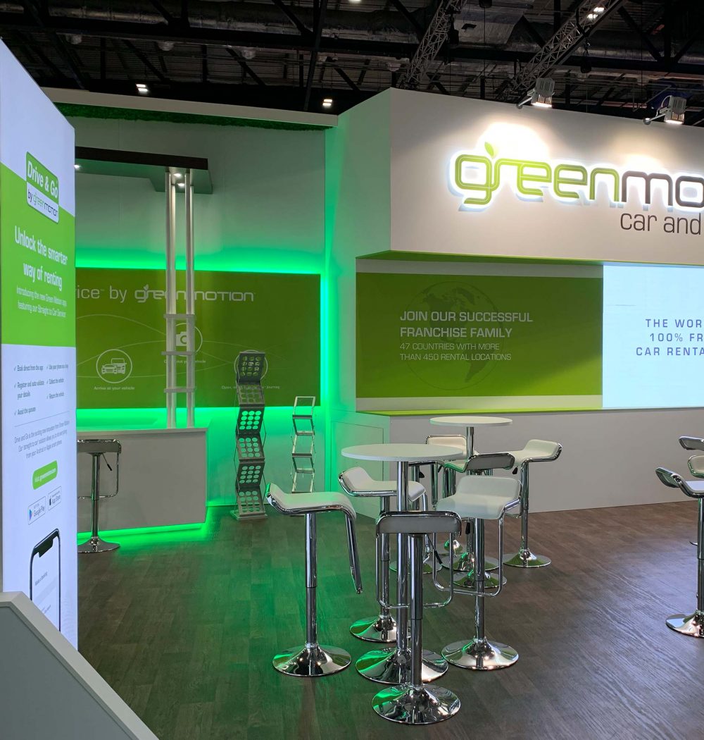
Green Motion's Trade Show Stand
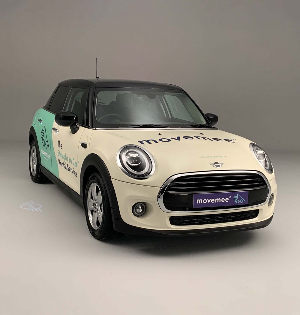
Move Mee's Vehicle Livery
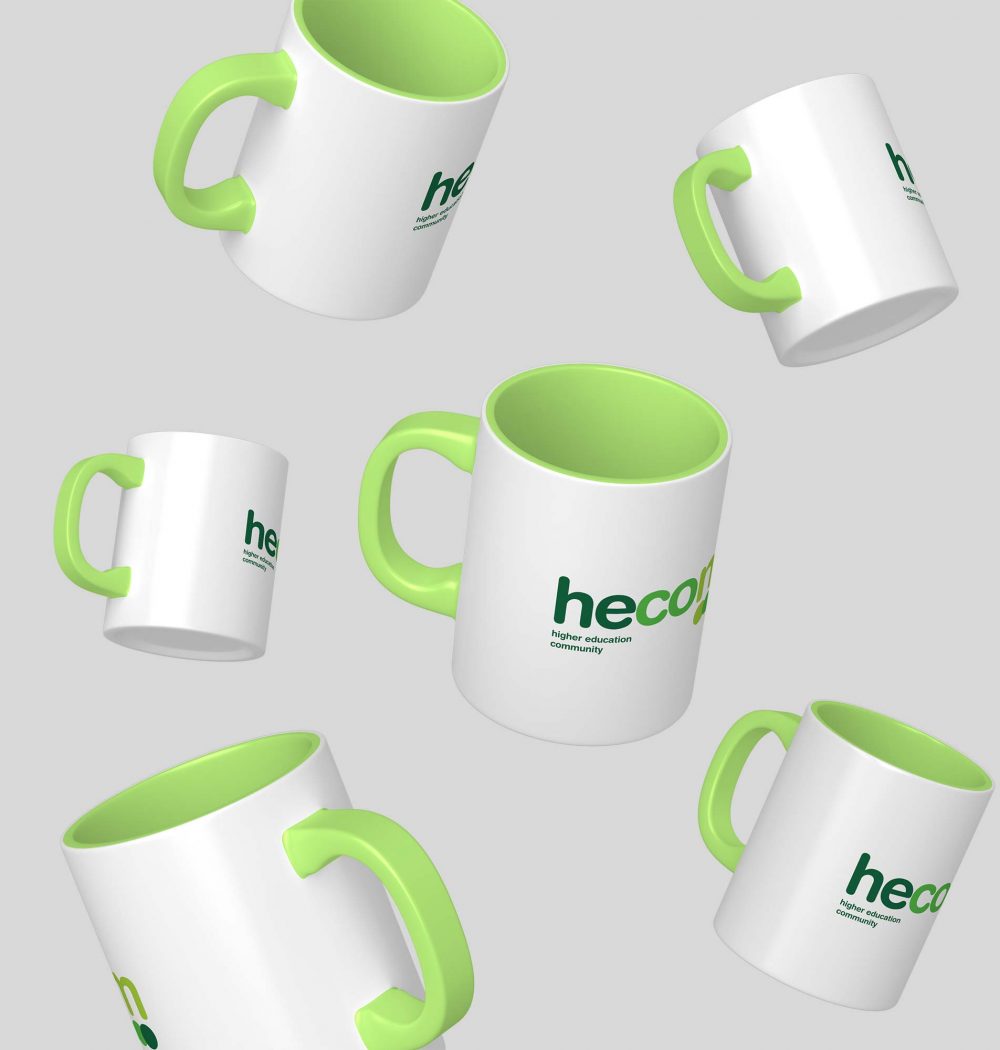
Hecom's Promotional Items
What Our Clients Say
KC Tuition
When I required artwork for a new branding, I knew I needed a creative design agency on the same wavelength as myself. We-Design was the best choice. They took the time to discuss the brief and delve deeper into my final expectations. They quickly followed up our initial meeting with an array of outstanding examples by providing multiple artworks, they had allowed me to make a faster decision and proceed promptly in producing the signage. I was thankful That I found We-Design.
The Red Lion Pub
We have been working with We-Design since the re-brand of our logo in 2016. They have provided a sterling service and extremely high-end print for us. We plan to work alongside We-Design for the lifetime of our brand and would highly recommend them for print & design.
Daily Zen
It was a pleasure working with We-Design. They were fast, flexible and very creative. Their proposals always improved the project. I would work with them again without a doubt.
Sonora Estudios
We-Design designed and created a website and business stationery for K.C. Tuition Services. I was delighted by the end-product and impressed by their skills, creativity and attention to details. After careful research We-Design also made useful suggestions which enhanced and complemented my needs and preferences. I would not hesitate to recommend We-Design to anyone who wants to create a new and original website and related products or who wants to simply up-date their existing one.